Aviris UI
Quube ProductBuilt a comprehensive component library and documentation platform to help React developers ship faster, turning a technical idea into a polished, production-ready product.
Building a comprehensive React component ecosystem
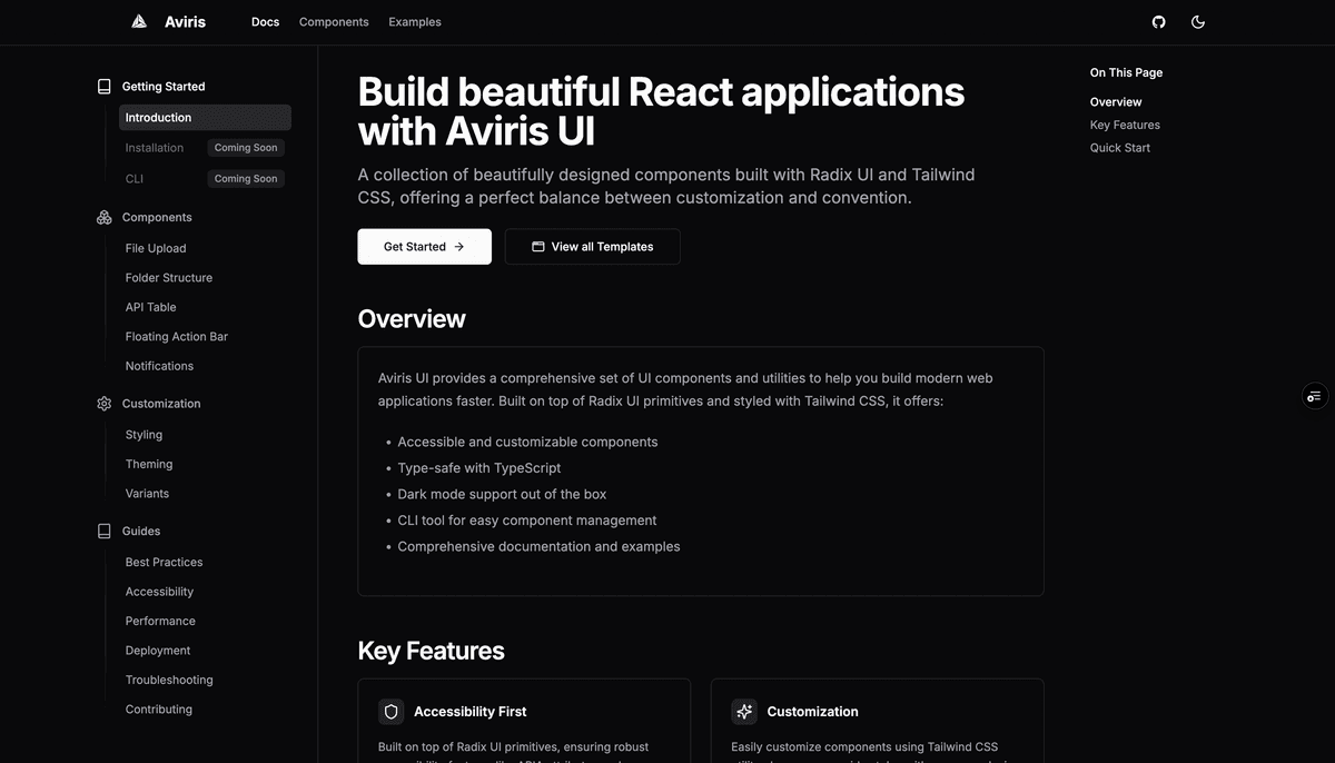
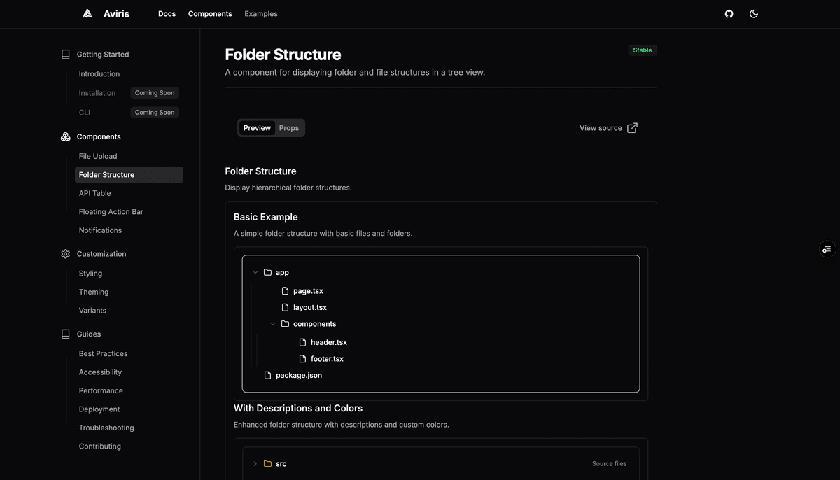
Aviris UI approached Quube to create a complete component library and documentation platform that would serve the React development community. The challenge was to build a system that combines the power of shadcn/ui with enhanced features, providing developers with 50+ ready-to-use components, 100+ code examples, and comprehensive documentation. We created a modern, accessible platform that enables developers to ship faster with production-ready, customizable components that just work.
Creating an accessible and developer-friendly experience
The platform needed to serve both component consumers and contributors, requiring a sophisticated documentation system and intuitive component showcase. Our design approach focused on:
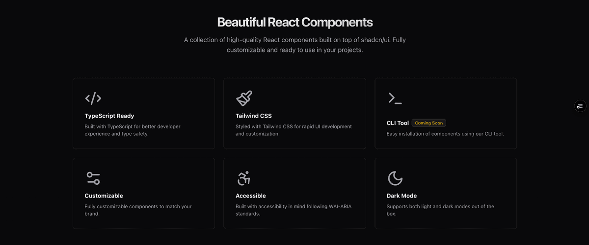
- Building a comprehensive component library with TypeScript support and accessibility features
- Creating an interactive documentation platform with live code examples and customization options
- Implementing a CLI tool for easy component installation and management
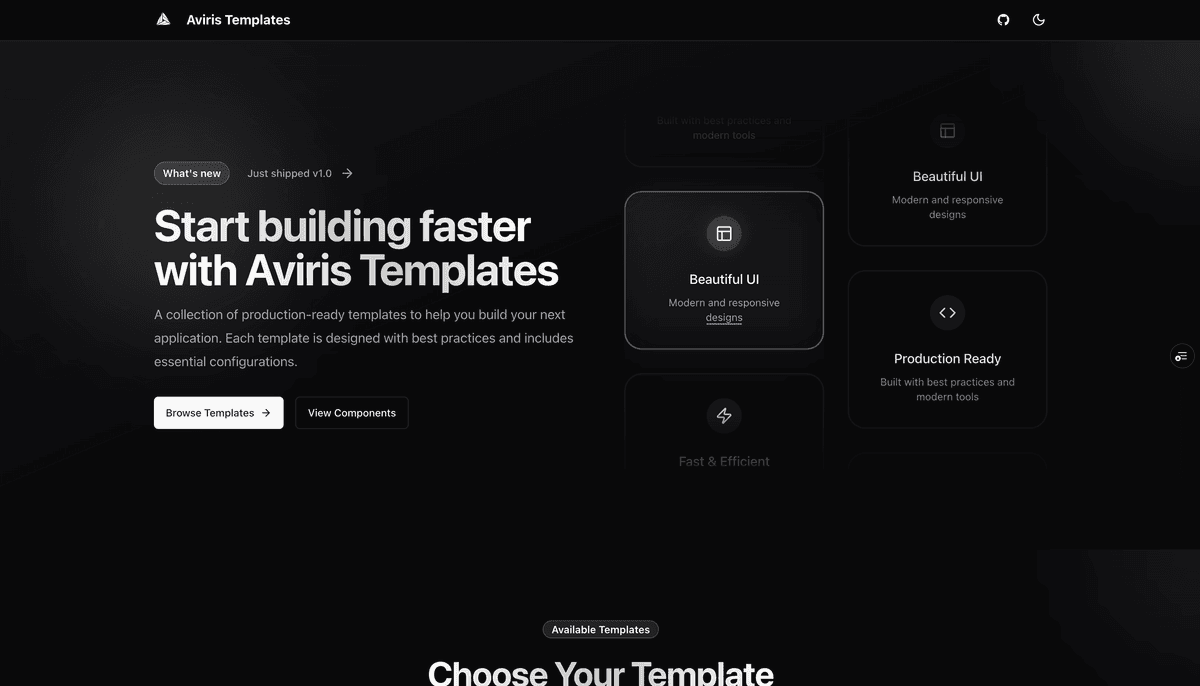
- Developing a template system with dashboard, e-commerce, and authentication starters
- Ensuring full dark mode support and responsive design across all components
Modern development tools and community building
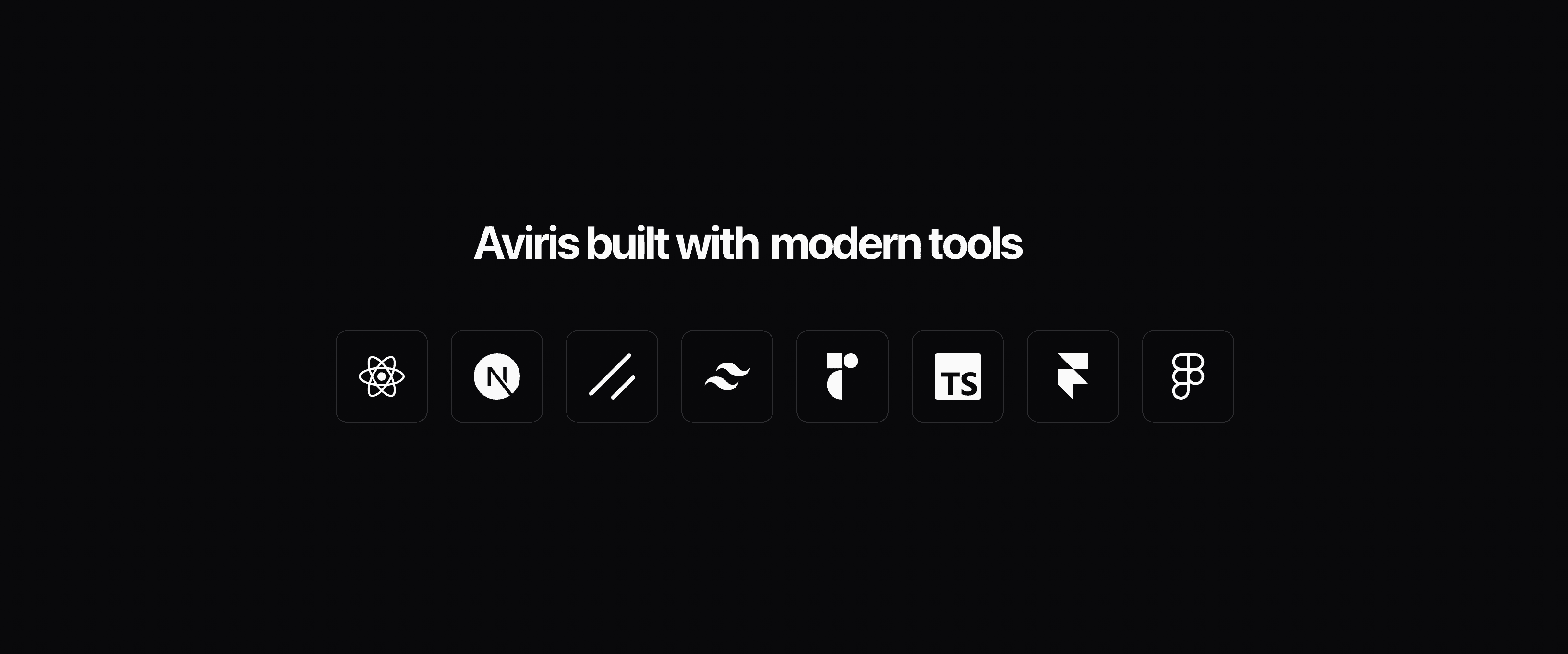
We integrated modern development tools including React, Next.js, Shadcn UI, Tailwind CSS, Radix UI, TypeScript, and Framer Motion to create a robust development experience. The platform features 95% documentation coverage with examples, 24/7 updates, and continuous improvements. Built by @jkghartey, the project includes official GitHub libraries, community templates, and comprehensive guides for best practices, accessibility, performance optimization, and deployment strategies.
More of our work
More client work, products, and concept pieces, each one labeled.